


Supermarket design
When designing this supermarket, our aim was to create a space that is not only modern and visually appealing but also highly intuitive for customers.
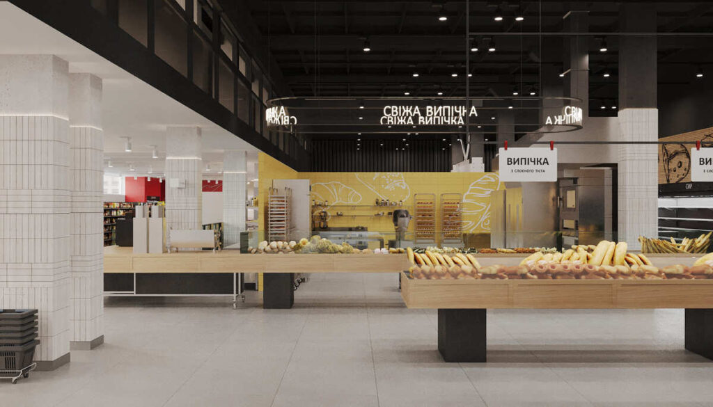
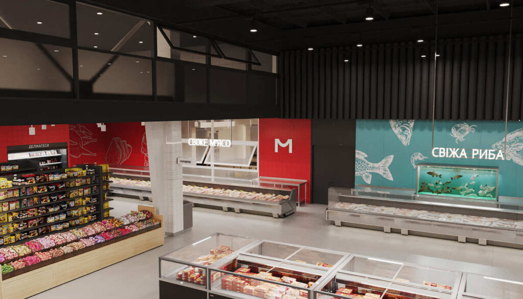
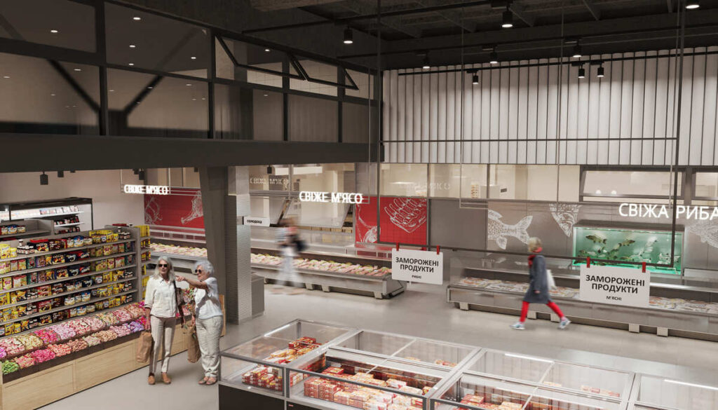
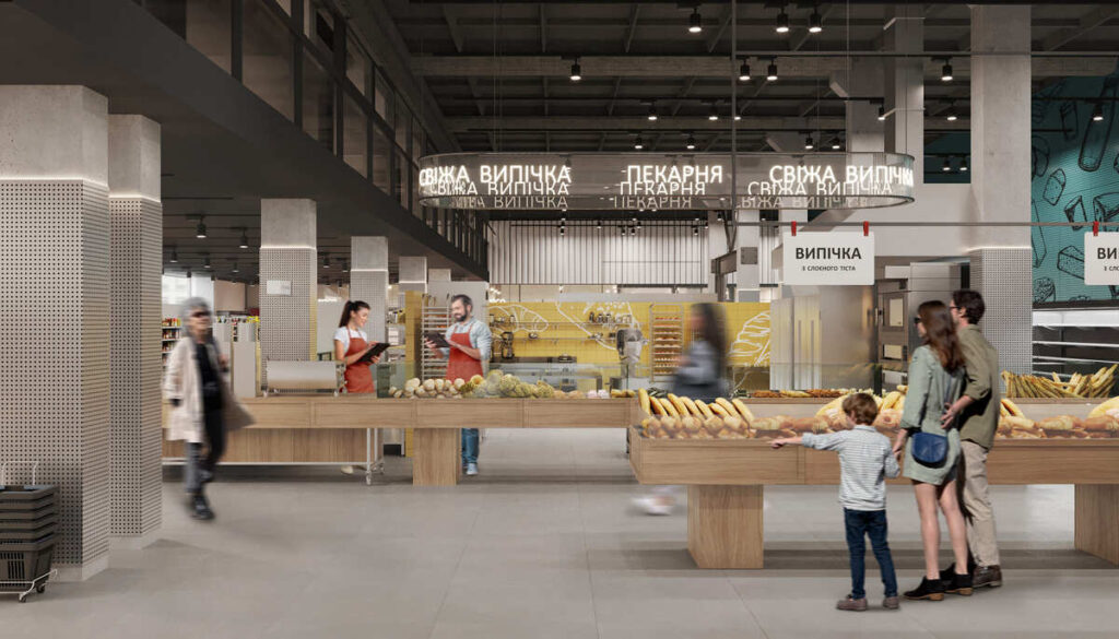
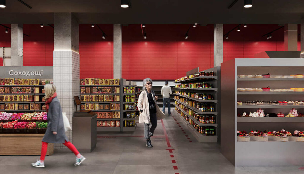
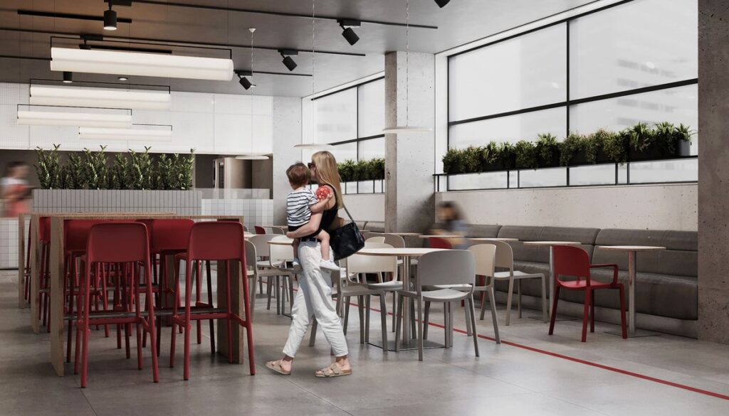
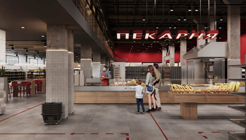
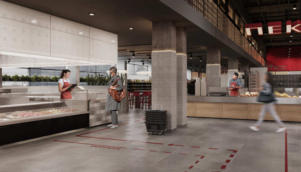
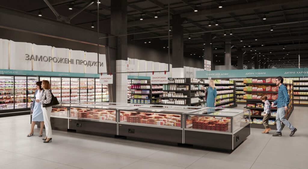
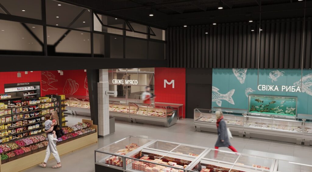
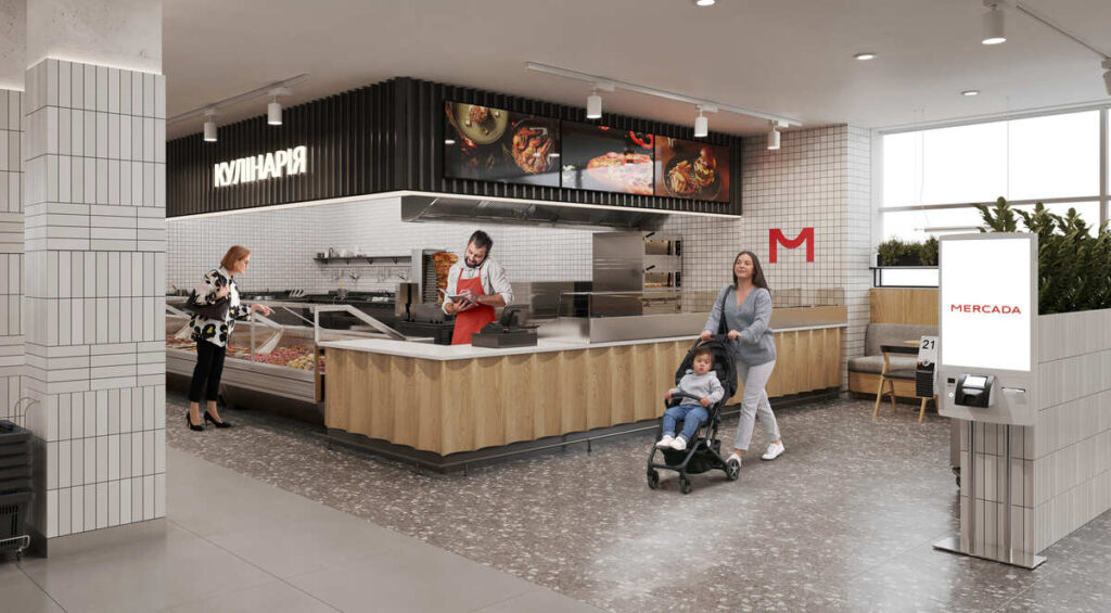
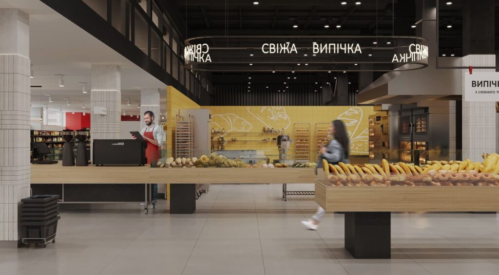
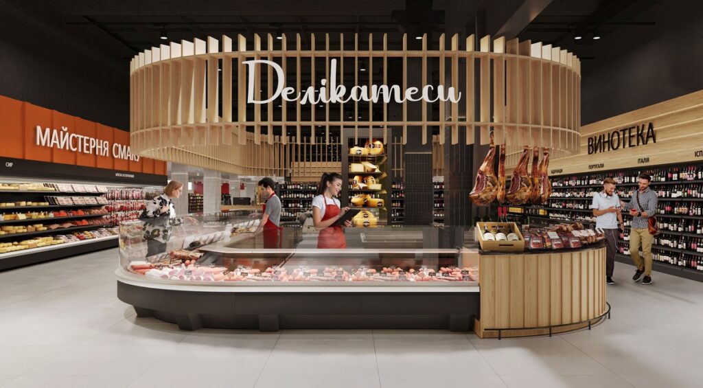
We treated navigation as a design tool: clear signage, easy-to-read infographics, color codes, and visual accents that guide shoppers naturally. Open sightlines allow visitors to immediately understand the store’s logic, while thoughtful zoning creates a fluid path — from everyday essentials to specialized sections.
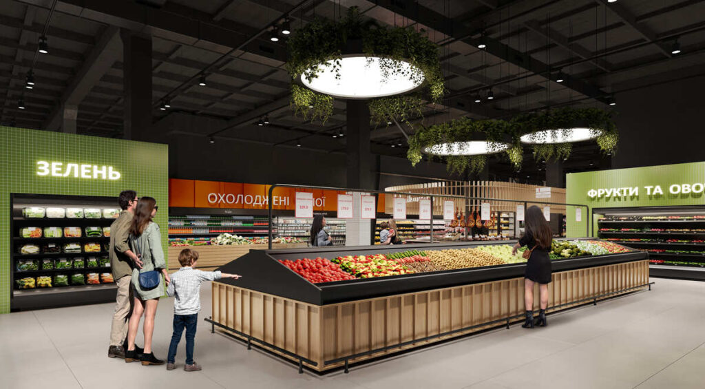
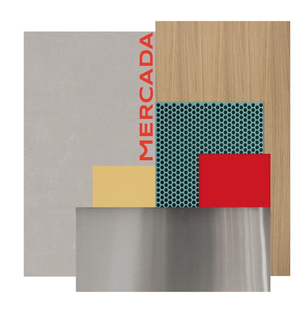
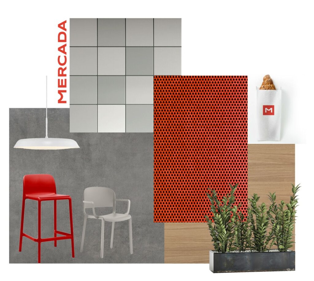
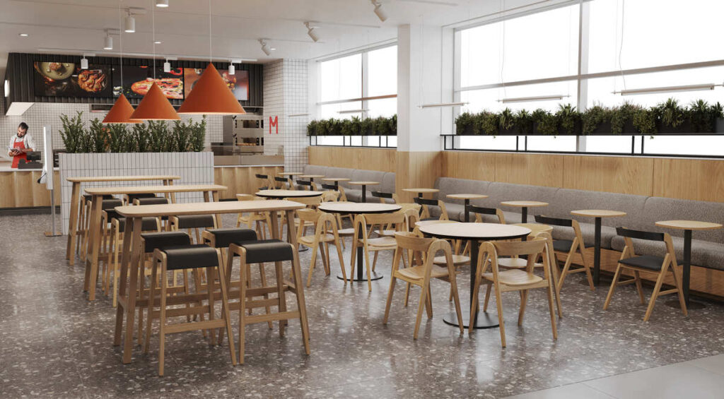
We used contrasting materials and colors to emphasize different areas: warm wood tones in the bakery, light and clean shades in the dairy section, and vibrant hues in the fruit and vegetable zone. This approach brings harmony to the interior while subtly guiding customers.
Lighting was another key focus. A layered system combines uniform general illumination with accent lighting that highlights freshness and makes products look more appetizing. For us, it was important that shoppers feel confident, comfortable, and leave with a positive impression of their visit.
Contact us
Inna Dovhalova
Founder, Art Director
